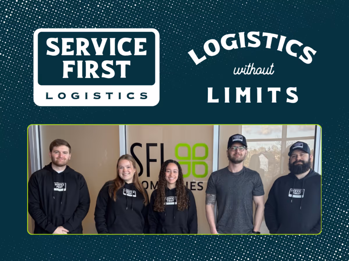
Throwing It Back to Move Forward: Why We Created Retro Marks for a Modern Mission
Every company has a logo. Not every company has a rallying flag.
At SFL Companies, our primary logo represents who we are in the marketplace; professional, disciplined, and built for scale. It carries credibility. It reflects our standards. But culture is not built by standards alone. It is built by identity. By shared belief. By something people want to stand behind.
That is why we created retro, throwback logos: bold marks that leans into our roots while reinforcing two defining ideas:
- Service First
- Logistics Without Limits
This is not a rebrand. It is a reinforcement.
Why Retro Marks?
Retro designs signal grit. They feels earned, not manufactured. In logistics, especially in temperature-controlled freight, trust is not built with flash. It is built with follow-through. The throwback look reflects a blue-collar work ethic. Show up early. Stay late. Solve the problem. Own the outcome.
It reinforces who we are.
- We step into volatility. We protect supply chains. We take responsibility when conditions tighten.
- We stand shoulder-to-shoulder with our customers and carrier partners. We are accessible. Practical. Grounded.
- We do not accept limits at face value. We look for new lanes, new strategies, and new ways to create stability in unstable markets.
The retro marks captures that blend: strength, humility, and forward motion.
Service First Is a Standard
A logo alone does not create culture. Behavior does. “Service First” is not just part of our name, it is something we practice. In a tightening freight market, especially in cold chain, heroics are not loud. They are disciplined.
Service First means:
- Anticipating capacity constraints before they hit
- Communicating proactively when volatility rises
- Taking ownership when disruptions occur
It means we exist to serve, not to transact. The retro marks become a visual cue for that standard. When our team sees it, it reinforces the expectation. We move first. We solve. We protect.
Logistics Without Limits
The freight market is evolving. Capacity constraints are increasingly structural. Weather events amplify volatility. Seasonal shifts move faster. Playing small does not work in this environment.
“Logistics Without Limits” reflects how we respond. We do not allow market conditions to dictate our mindset. We build carrier networks that can flex. We leverage data to plan ahead. We make decisive moves when others hesitate. Limits in logistics are often self-imposed by assumptions, by outdated strategies, by fear of change. We choose a different posture; Confident. Prepared. Forward-looking.
The retro designs reinforces that mentality. They feels bold because the mindset behind it is bold.
Going Off-Brand —> With Intention
Strong brands require consistency. Strong cultures require energy.
There are moments where leaning slightly off brand, in a controlled and intentional way, creates connection. It shows personality. It builds internal pride. It humanizes the organization without weakening its professionalism. The key is alignment. If a design element strengthens the mission, reinforces core values, and deepens trust, it is not dilution. It is amplification.
Our corporate logo represents who we are in the market.
The retro marks represents what we stand for internally and how we show up when it matters most.
One builds recognition. The other builds belief. Culture Is the Real Brand. A logo only matters if people feel it. That happens when leadership models the behavior behind it. When Service First shows up in performance expectations. When Logistics Without Limits shapes strategic decisions. When wins are celebrated because of customer impact, not just revenue growth.
Culture compounds over time. Symbols accelerate it. We did not create throwback logos to look different. We created it to remind ourselves who we are when pressure rises.
We serve first.
We operate without limits.
And when supply chains need a steady hand, we step forward.
That is not nostalgia. That is conviction.